C Mini: Project 3
typography video process and experiments
11/27/23
What information are you using to inform your audio selection? What kind of music/sound genres are you exploring and why?
Chosen font: Noto Sans
Of the two fonts I was given from project 2, I decided on Noto Sans — I wanted a less complicated font that had a seamless nature to it (i.e sans serif). The words I used to describe it in the previous spread project were balanced, accessible, & youthful.
I don’t necessarily see youthful as an appropriate adjective anymore, but it certainly is modern, or sleek.
With this in mind, I’m thinking of exploring a type of spatial, ambient sound for this video that’s reminiscent of tech corporations or fun corporate memphis presentations the likes of Apple or Google, which was where the font was commissioned.
I think the sound byte used for the video should be giving off a revelatory, inventive sound, as the font was created as a solution to a widespread problem.
moving type required reading:
Music links (will find more later):
11/28/23
Arrive in class with your final audio selection and a well developed storyboard. Be ready to create digital storyboard and assets in class.
Answer on Medium: What is the pace and tempo you are envisioning for your video? How is the music/sound informing type, scale, color, transitions, etc. Include audio samples and images of your storyboard and details where appropriate. (Bonus points if you reference Woolmam/Bellantoni reading!)
additional marks to hit:
- revise essay and turn into quick script
- pick a final music track
- brief some storyboards
Revised Script:
In the earlier days of the internet, unrecognized text would often be displayed as a blank rectangle, or what developers would call “tofu” — a placeholder for unknown or missing glyphs.
In 2012, Google commissioned a project to create a font to make all these unrecognizable glyphs seen.
“no more tofu”
Noto Sans
Released in 2013, Noto Sans is part of the larger Noto family commissioned by Google as a means to solve a rendering problem in text encoding.
Wide apertures and low-contrasting strokes for a uniform look. Spacing between letters are clear and unobstructed– balanced, accessible, and functional.
Noto fonts are a global effort that cover different alphabets: Latin, Greek, Cyrillic, as well as Chinese, Japanese, and Korean.
Over 3,471 glyphs of Noto.
Available to everyone.
Making the unknown understandable.
Noto sans
so, I found a couple more songs. I made a playlist actually — part of it ripped from a coffee youtuber’s soundtrack playlist. After a long hour or two of imagining the script to royalty free beats and 808s, I settled on this song:
11/29/23
At some point, I tried editing the audio to see if I could get more runtime in the beginning before the beat drop.
I honestly do believe that the song might be more frustrating as it goes, so I’m open to changing it and sticking to the script — I’d just be changing some visual cues to fit the sound.


I am not savy enough in Audition or Rush to do that, so I just decided on editing the script and moving onto the storyboard; I think it was more trouble than it’s worth.
Really bad timing to learn new information:
The Noto fonts are perfect for harmonious, aesthetic, and typographically correct global communication, in more than 1,000 languages and over 150 writing systems.
“Noto” means “I write, I mark, I note” in Latin. The name is also short for “no tofu”, as the project aims to eliminate ‘tofu’: blank rectangles shown when no font is available for your text.
Nearly half of the 6,000 languages spoken in the world are endangered. Noto includes fonts for nearly all of the world’s writing systems (scripts): from Latin, Chinese, Arabic, Hebrew, and all Indic scripts, to Egyptian hieroglyphs and emoji.
The fonts use Unicode and OpenType (ISO Open Font) international standards for accurate, professional-quality rendering of all orthographies.
So, I’m going to edit the script again — clearly I have missed some information and I need to alter the script to match the vision and intention of the font. New Script:
In the earlier days of the internet, unrecognized text would often show up as “tofu” — a placeholder for unknown or missing glyphs.
Text [like this] could show up [like this] in a different country.
In 2012, Google commissioned Monotype Imaging to solve this issue:
“no more tofu”
Noto Sans
a solution to an international rendering problem in text encoding.
Wide apertures
low-contrasting strokes for a uniform, humanist look.
clear and unobstructed– balanced, accessible, and functional. Supported on every screen, anywhere.
Noto Sans’ fonts are a global project that aims to cover all the world’s languages and preserve endangered writing systems and languages.
Over 3,471 glyphs of Noto (and counting).
Available to everyone.
Making the unknown understandable.
Noto Sans
[cut to black]
You know, I’ve really just been thinking about the Nintendo Switch ad spot — it’s so seamless and catchy, what I seek for Noto Sans:
Along with a myriad of other title sequences and kinetic typography vids; I think the smooth slides and sense of connectivity these videos provide are a foothold to finding a solution to some of my concerns.
Storyboarded frames according to script/song timing:
(definitely phoned it in on this one.)

11/30/2023
I changed my song and scrapped my thumbnails in class! I had the idea to use Sound and Color by Alabama Shakes — which was also Cooper’s song. After a brief 2 minute dilemma in class, I will be sticking with the song because “I hated the other one so much”.
I did, still do. I definitely struggled with trying to fit my exposition and phoned in my thumbnails last night. My thanks to Cooper and the TAs for agreeing on me using the song. They’re at different timestamps, so the sounds are rather different.
After that, I revised my script with Vicki — which I have edited again and will put here for reference:
This is “tofu” — a placeholder used for unknown or missing glyphs in text encoding.
Text [like this] could show up [like this] on a screen in a different country.
In 2012, Google commissioned Monotype Imaging to solve this issue:
“no more tofu”
Noto Sans
a solution to an international rendering problem in text encoding.
Wide apertures.
low-contrasting strokes for a uniform, humanist look.
clear and unobstructed–
Balanced,
accessible,
and functional.
Supported on every screen, [every/where]
part a global project that aims to cover all the world’s languages
And preserve endangered writing systems and languages.
Over 3,471 glyphs of Noto (and counting).
Available to everyone.
Making the unknown understandable.
Noto Sans
side tangents | computer issues
[this is a catch-up article]
11/6/2023
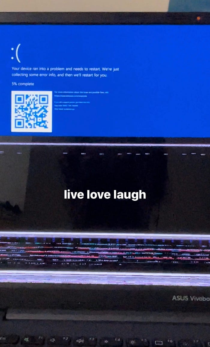
I think that one of the biggest things I neglected to mention throughout this project is that I have consistently been dogged by PC issues in After Effects and translating Andrew’s demos to a PC UI. In general, I struggled with getting beyond the learning curve with After Effects, so I practiced by using it for a video essay project on my PC! yay!
And then my PC crashed (multiple times), rendering it so unusable that I had to switch to a Mac, another learning curve! yay!
As of now, I type this from a loaned mac laptop from IDEATE. I lost progress on the video essay due that night, along with the beginnings of my thumbnails on illustrator. I’ve only gotten a functioning laptop now because the previous two loaned pcs didn’t let me access AE, and the lending library closed. I’ve been working to finish the video essay due this Friday on extension, and have been neglecting progress on the typeface animation.
Suffice to say, I am very behind.
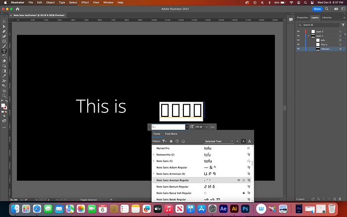
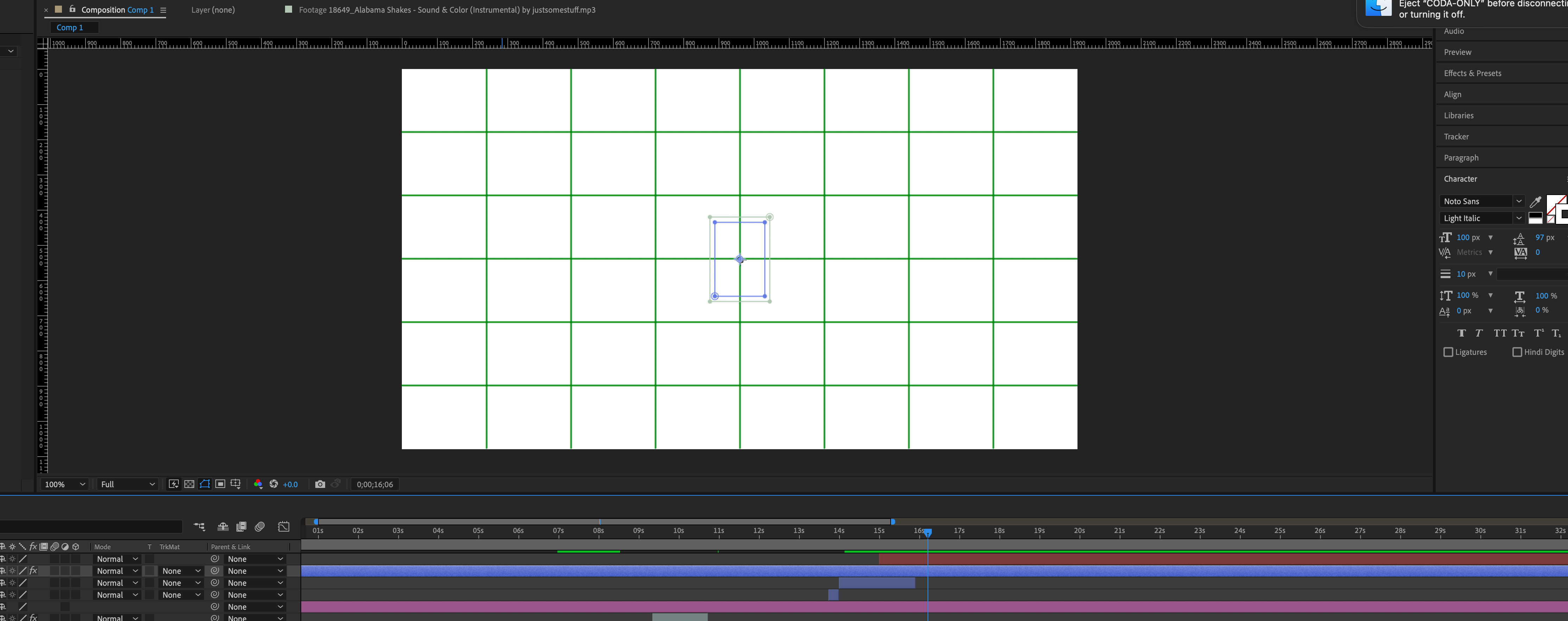
Here’s another thing I ran into initially with doing keyframes (yes I am doing this all very late) was that I couldn’t manually get the tofu glyph. It would show up as a placeholder, but default to myriad pro. There were also so many Noto fonts that I got overwhelmed. Surprise, the Noto family is so successful that I can’t actually get tofu anymore when I need it!
Eventually, I figured out I could switch off the settings for replacing unknown or unsupported font. crisis averted.
In other parts, I have scaled back the starting time stamp of the music, as the beat drop should punctuate the solution (noto sans), not the problem (“this is tofu”). I expect the script to be shortened down the more I work on this.
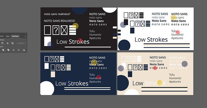
Here are the funny little tofu guys I made after the different kinds of tofu used to sub in missing glyphs:

they bring me much joy. Tofu looks different across the board.

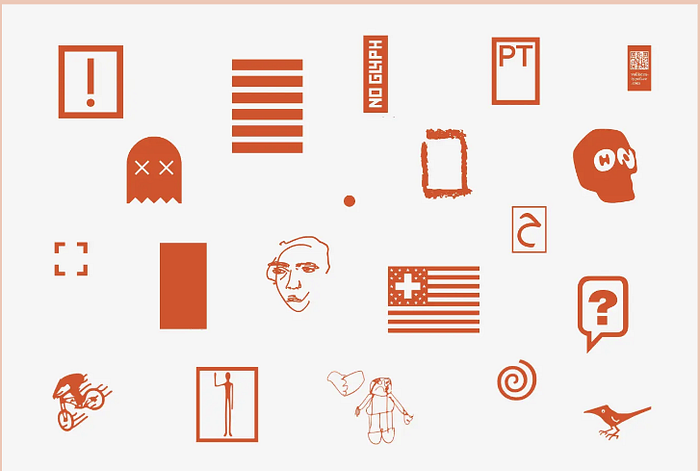
Of course, not all of these are actual tofu special glyphs. However, these images were the grounds for some of the ideas I had about using tofu as an asset for the video in a sense.
11/12/23
Full admission: I spent the weekend on digital imaging assignments due on Monday, very little to none on the typeface video. Catching up for tomorrow is the main goal, along with understanding masks and executing ideas in AE. Here are some more rushed thumbnails I’ve logged below:
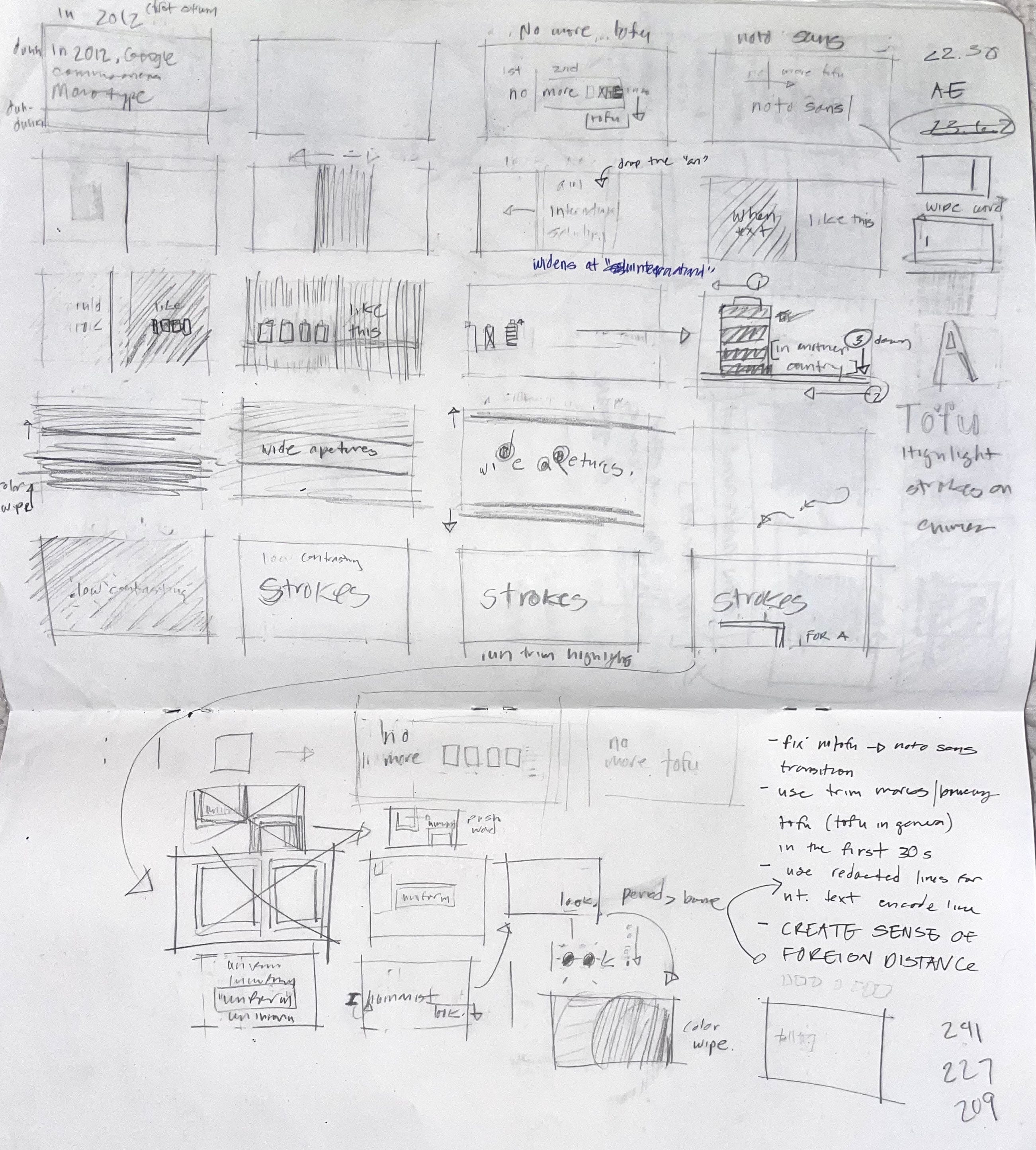
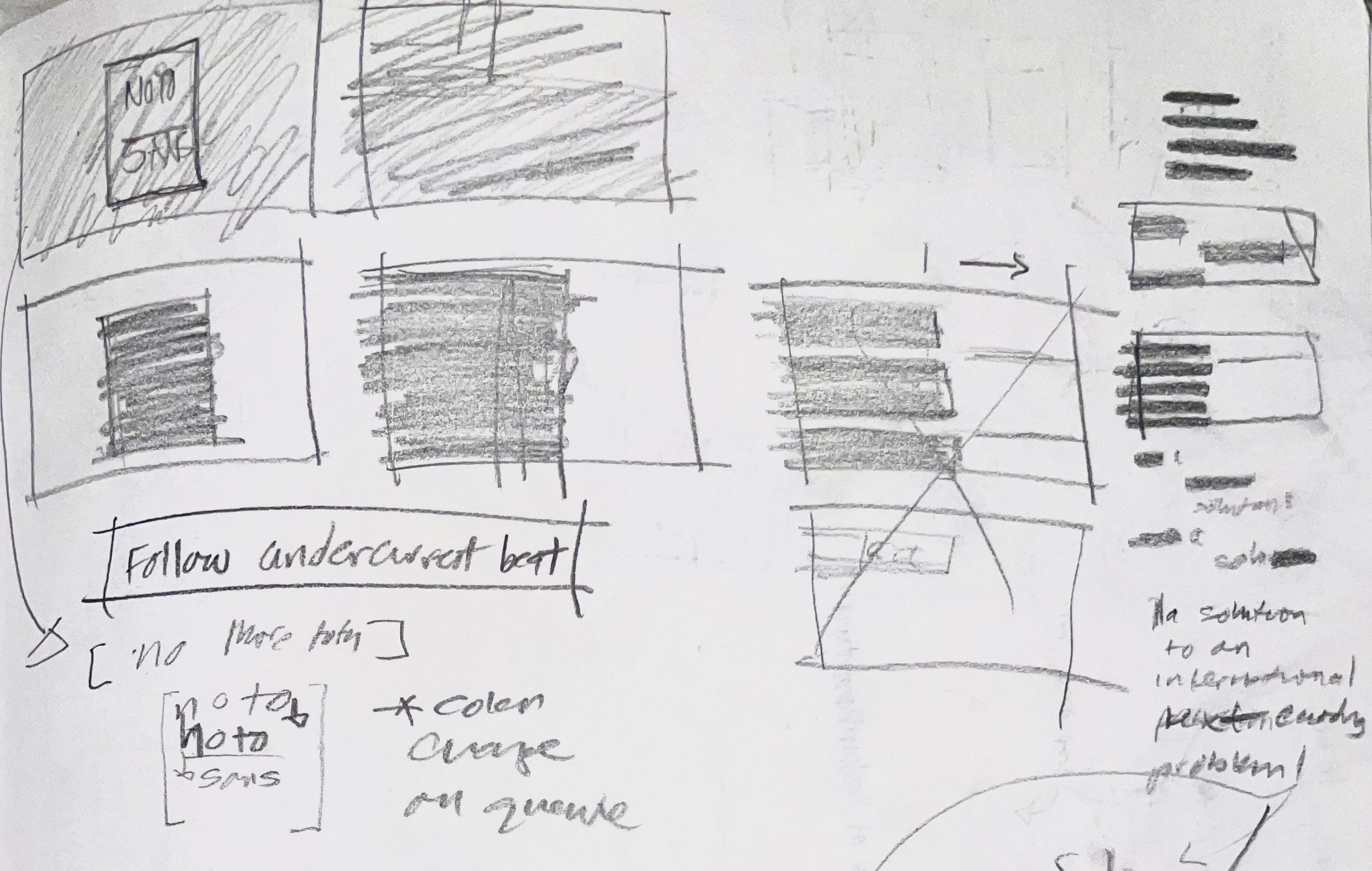

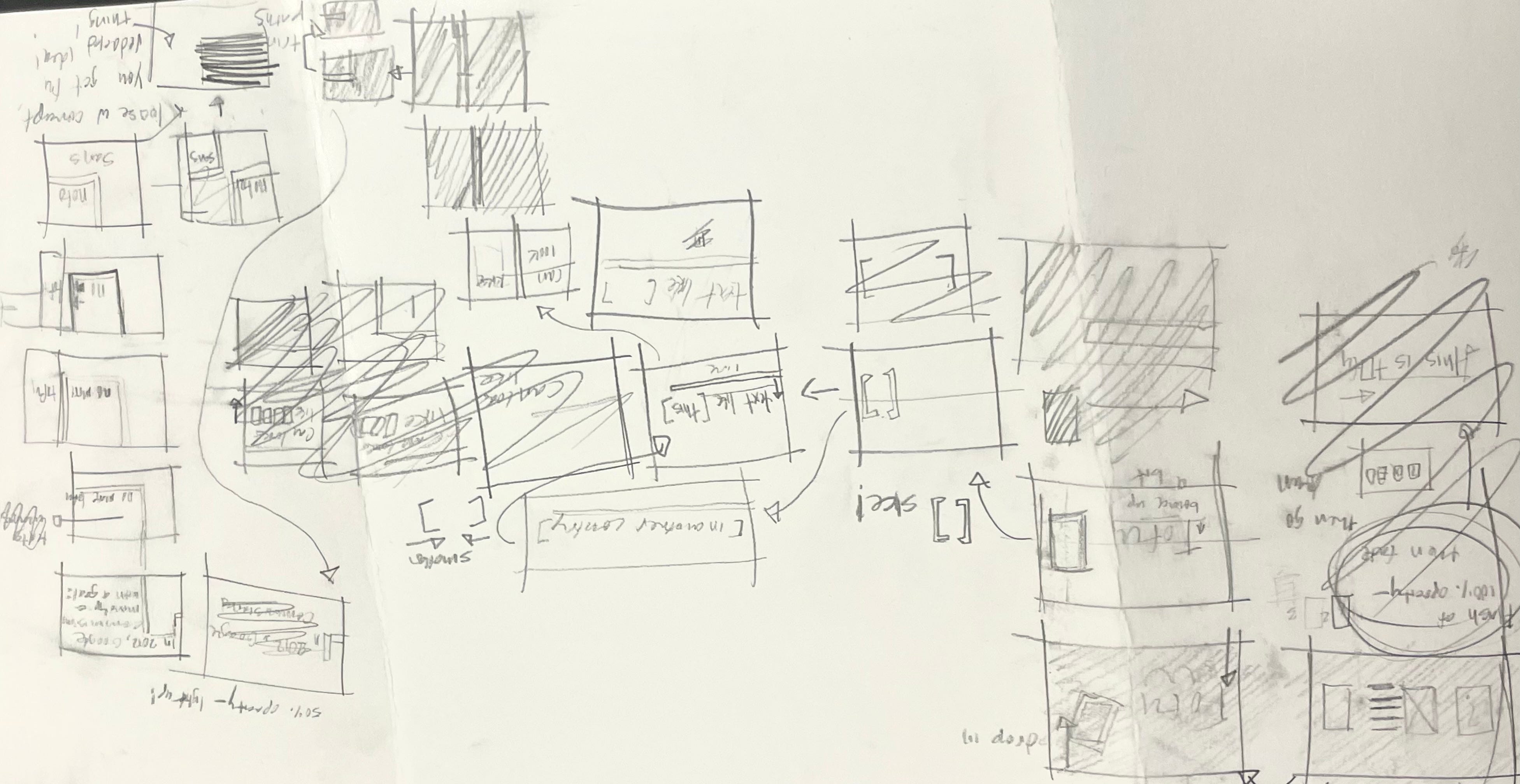
One of the running ideas I have for the typeface essay in general is the use of tofu blocks obscuring text and leading the motion, along with some beats of rhythm in the video. Since Noto Sans is meant to solve a communication issue, I think it would a fitting motif.
I’ll mark this one down for later but I struggle with color. I’m thinking a palete that is black and white, with spot orange or navy. Or, shades of a navy and/or cerulean palette. I’m not sure at this point and I’m quite concerned.

extra edit 12/13/23:
I am pulling my video out from the final showcase because it will not finish in time. I can confidently say that my tech issues, but mainly personal problems with time management and indecisiveness with concept have snowballed into this result. Last night I unfurled most of my project down to 6 seconds, and lost a good 20 seconds — I was in rough shape from the start, with what little I had.
Last week, I poured alot of time into redoing a separate video project for a design studies class, and missed the deadline to a different class this week.
The laptop I will be typing on has to be returned by Friday, so the goal now is to just rest. (12/17/23)I previously wrote that I was going to get the bones of this video out and work on the redos even more, but I stayed up so much that I decided on sleep and catching up when my body feels less sick and tired.
12/17/23:
it should be evident by the date alone that I should definitely not be working on this project by now. Since final showcase, I’ve had a few more mishaps:
the mac laptop I used did not recognize the license on adobe and would not let me run it the day after showcase (or was it the day before showcase?) I cannot exactly remember. Nonetheless, I returned it to ideate because I could only loan it for so long.
I unraveled an okay amount of progress on that laptop that my auto save did not cover. this was a very bad mistake, as during my process, I let the perfectionism in me roll back so many takes to get to a problem in one of the scenes that I erased a lot of work. This is a mistake I take seriously, since it wasn’t a laptop crashing on me or a circumstance out of my control. Definitely an issue I marked down throughout all my project medium posts.
[edit: I left the saved mp4 files of my previous noto sans intro drafts on a drive left in Pittsburgh. Currently mourning the loss since the files that carried that work have missing content I cant retrieve from my house.]
Another thing: I had a decent amount of trouble with understanding how to import illustrator files into after effects. Every single project I started for this assignment I either import it wrong or forget some boxes to click. Human error on my part, but Ellis definitely came in clutch to help. Also, alot of missing files when I would switch computer to computer, alot of replacing files and irreversible losses when frantically trying to back up and organize the mess of assets and outdated files in my folder.

One More Thing:
The Smillie lab computers do not run the same version of AE as the mac ideate laptop.
It would not let me run that previous file. So on Saturday morning, I made a risky decision: I basically started again. I don’t have admin access to roll back to previous versions of Adobe applications, and I don’t think there was much else I could do about opening up an outdated file. If there was a solution I didn’t know about, I just might ram my head into the desktop. Hooray!
If we are keeping score, I have went through about 4–5 computers trying to complete this project the past two weeks. Every single one ended up having hardware issues or license/version issues. If I weren’t so stressed I would find it quite comical.
At that point, I understood that I did not have the time to create the ideal vision of Noto Sans that I had on my scrappy drawn (and abandoned) thumbnails. I decided on quickly drafting some new scenes that were less taxing time wise. My proficiency in After Effects leaves a lot to be desired, and I am slow to animate, but if the video was too complex, I would probably not finish it on time before my flight on Tuesday.
other than chronicling the incredibly tumultuous and tear-inducing journey of finding a computer that works during finals week, here is what I can say about process and some decisions about final showcase, and the noto sans video:
- I revised the minion spread. I’ve been meaning to add in a typeface analysis since it had a lot of space and needed more…colors? shapes? I added it in the night before. Unfortunately, the printer burned the colors and removed the weight off some of my letters so as to look mismatched, but I didn’t want to waste paper and ink. It looks more informative:
- I’m actually quite happy with it, at least in screen form. Looking back, it was my least print/tech issue-heavy project, so I didn’t have to worry about much else but the composition.
- It has come to my attention that I prioritize readability and rigidity at the expense of my ideas and current “eye” in terms of design. Trying to re-arrange the poster made me realize that.
- I have been working in black and white for the video, I have from the start. I think spot colors like red or orange would be effective, but I think it’s on the lower list of priorities for the video. My main priority is actually finishing the thing. I can change colors later scene by scene.
- Tempo and rhythym have become a strong point of focus — and concern. I am fixated on matching the words and animations to a strong rhythmic flow in the song. It practically carries my ideas, and I worry the scrawled ideas in my thumbnails are too few ambitous given the time I have.

- I think color is a great way to spice up an otherwise boring video, and since I can’t perfect alot of tools and ideas in time to create a strong video that is in just black and white, I’ll round that corner later. I think for black and white to work, I would play with a lot of patterns and shapes that would drive me insane when it comes to trim paths and importing from illustrator. It will probably come down to how fast I can be with animating.
In the end, the video I submitted was about 42 seconds long, a far cry from the minute long standard that was stated in the brief.
Will I work on this again? Yes, because in honesty I do not see this as a final typeface video, but the result of what I could do given the circumstances. It doesn’t feel like a fair culmination of what I set out to do for this project.
This is by no means meant to be overtly critical or cynical, though my writing voice definitely sounds that way. I think that I was hit with a lot of new problems during a pivotal week, and trying to document it without the sound of burnout in my writing puts into perspective how challenging I found it to be. I’m disappointed that I didn’t get the time to refine a vision and a standard I set for the work at the start, but things like crashing computers and missing assignments happen, and we make do.
Someone in studio (Kai) said I was technology cursed, and he is probably right. I have the Midas touch of crashing laptops and invalidating licenses, and I sorely need a new laptop to work over break. For now, here is the video:
https://drive.google.com/file/d/10wLNzNOf4u7MyZ6O_f27WT2QUhmHevJ6/view?usp=drive_link
